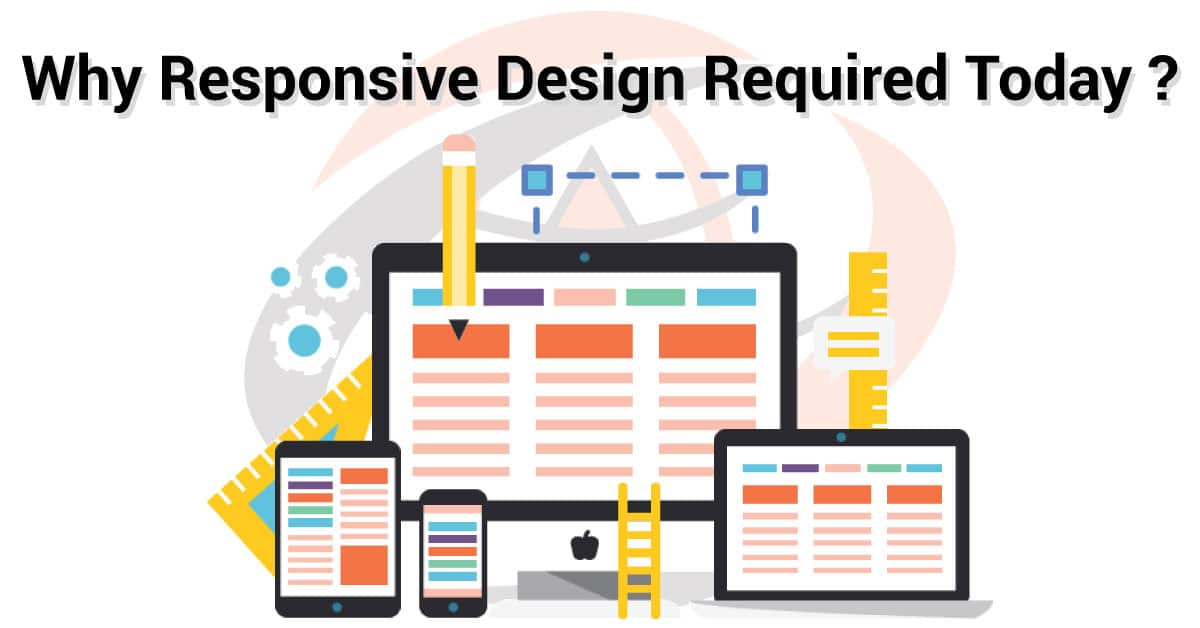
Responsive Web Designs or RWDs is an advanced approach during the inception stages of website making. This approach makes the website flexible to render in shuffled formats according to screen size and orientation of different devices.
In this article:
Benefits of Responsive Web Designs
Responsive web designs for your website is highly likely to bestow you with loyal visitors and customers in many ways. Have a look at the top five benefits of having smart and responsive web designs:
1. Higher Conversion Rates
 No one likes to browse around on a boring, unresponsive, unintuitive website. Any traffic that lands on your site will only be possible to retain if the user interface and website design are responsive enough to keep them entertained, intrigued, and informed. A disoriented visitor will leave your site if the right information isn’t displayed in an easily accessible manner. Satisfaction leads to productivity and if your website leaves the visitor satisfied, your conversion rates are sure to shoot up.
Higher conversion rates are something that is transcended by another benefit of responsive web designs- lower bounce rate. The lower the bounce rate of your website, the lower number of visitors leave within minutes of browsing, the higher possibility of greater conversion rates.
2. Higher Lead Generation
 It can be fascinating how responsive web designs can help to generate more leads. Any website has elements that particularly aim at generating leads and converting them. Whether these are marketing forms or FAQ sections if your website cannot scale to different sizes according to different devices, the visitor will be left frustrated.
Busy leads that land on your site on the phone or tablet will need an optimized web design. which is easily zoomable, with links that are easily clickable and form that are easily typeable. A web design that offers all of that can be definitive of greater lead generation.
3. Greater Traffic
 Over 51% of the worldwide website traffic in the first quarter of 2020 was recorded from mobile devices, according to Statista. That is over half of all the traffic generated, accounting exclusively for mobile phones, excluding other smart devices like tablets. These statistics are enough to explain the gravity of having responsive web designs that can be conveniently accessed by phone.
If your website design is not responsive, not mobile-friendly, you are at the risk of losing over half of the visitors you could have gained otherwise.
4. Faster Browsing Experience
A lower attention span is characteristic of millennials. Unless your site is quick to load, smooth to navigate, and fast image loading isn’t delayed, you’re going to lose visitor’s interest, and traffic. All of the above-mentioned problems start to appear when a website isn’t optimized for smaller devices. And obviously, It’s leading to make the browsing experience frustrating.
Making web design responsive by using advanced techniques like minifying CSS or leveraging browser caching will increase your website loading speed, and therefore deliver a faster browsing experience.
5. Lower Maintenance and Cost
Developing a responsive website is often mistaken to be costlier than developing two different websites for laptops and mobiles. The inaccurate conclusion is reached by overlooking the fact that the initial high cost is a mere investment. which proves to be cost-effective in the long term.
Developing two websites and app will come with their own sets of maintenance, configuration costs, debugging costs, besides the double hassle.
Tips to Make a Website Responsive
The advantages of having responsive web designs extend far more than the above-mentioned points. however, the right strategies to achieve web design responsiveness should be employed to avail of these benefits.
Here’s how you can go about it:
1. Non-Responsive to Responsive Web Layouts
When working on the foundation of your website, it’s always recommended to start with making a simple, clear, non-responsive design layout. When the perfect layout is achieved, you can move on tackling elements to make web design responsive, one at a time.
2. Media Queries

Media queries refer to the consistency of media and content display of the web design across different platforms with only as much variation as is required for optimization. Using media queries will be a comprehensive solution to creating responsive web pages. So, that your content will be displayed with minor variations on different types of devices according to the device’s screen size and visual qualities.
3. Grid Fluidity
 While the old-school unit of measuring picture size was pixels, websites now need a more advanced approach. Grids enable flexibility and fluidity to set your own rules by simply updating the CSS and codes of your website. Grids make a website design responsive by letting the dimensions freely flow, and conform according to the screen size.
4. Typography and Readability
Just like pictures, most conventional sites still use pixels for fonts. This gives rise to an often overlooked problem of typography. which might create troubles when it comes to readability on smaller devices. For responsive web designs, we need the text to be able to adapt to the width of the screen just like images. Mobile browsing gives the option to zoom into the website to be able to read clearly, and rigid text will make this an unpleasant experience.
5. Borrow or Outsource
We understand that making a website responsive requires above-average technical knowledge and regular updates in codes.
As a business person or entrepreneur, you may not be able to employ the right tools in the correct manner. That’s why there is an impressive market of readymade template designs and platforms that provide support for responsive web designs. Using templates will obviously mean a narrower range of options but outsourcing from platforms like Icon Technology can give you both, a highly customized website and an immensely responsive design.